
Color theory plays an essential role in floral design, and as a beginner florist, understanding the nuances of color combinations will elevate your designs and help you create visually appealing arrangements. Whether you’re designing for a wedding, an event, or everyday home décor, knowing how to mix and match colors effectively is key to creating cohesive and striking floral pieces.
The Color Wheel: Your Best Friend in Floral Design
The color wheel is the foundation of color theory and a helpful tool for any floral designer. It consists of primary, secondary, and tertiary colors, all of which can be combined in various ways to create harmonious arrangements.
- Primary colors: Red, blue, and yellow.
- Secondary colors: Orange, green, and purple (made by combining two primary colors).
- Tertiary colors: A mix of primary and secondary colors, such as red-orange, yellow-green, and blue-purple.
When selecting flowers for your arrangement, the color wheel will help you understand how different hues relate to each other and guide you toward creating visually balanced compositions.
Complementary Colors: Bold and Eye-Catching Contrasts
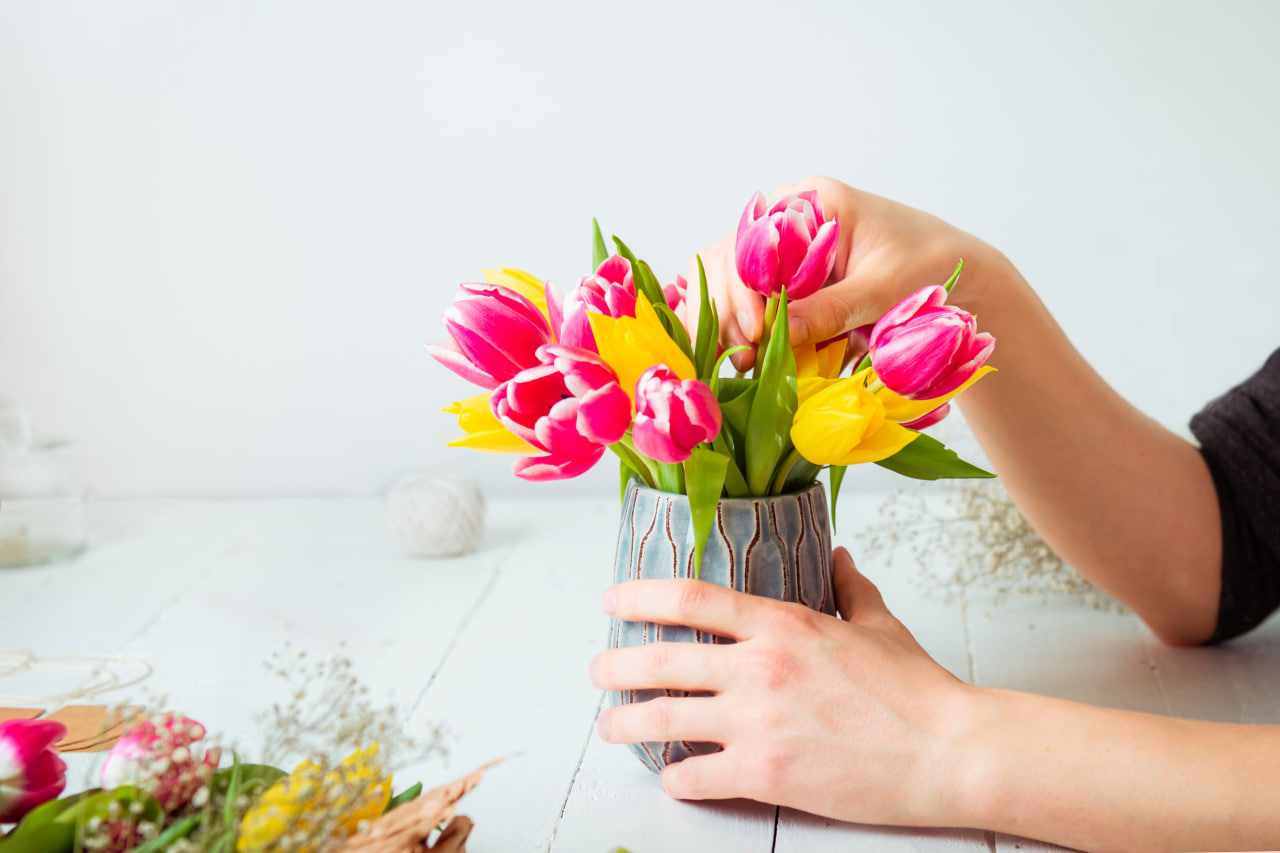
Complementary colors are those that sit directly across from each other on the color wheel. When paired together, they create a striking, high-contrast look that’s bold and attention-grabbing. For example, red and green, yellow and purple, or blue and orange are complementary color pairs.
When using complementary colors in floral design, it’s important to balance the intensity of each hue to avoid overwhelming the viewer. You can use one color as the dominant tone and the complementary color as an accent, or mix both in equal amounts to create a vibrant, dynamic effect.
Analogous Colors: Creating Harmonious and Calm Designs
Analogous colors are those that sit next to each other on the color wheel, creating a harmonious and serene look when used together. Examples of analogous color schemes include blue, blue-green, and green or yellow, yellow-orange, and orange. These color combinations evoke a sense of unity and calm, making them ideal for more subtle, sophisticated floral arrangements.
When designing with analogous colors, try to include a variety of textures and shapes to add interest without losing the cohesive look. You can play with different shades and tints of the same color to create depth while maintaining a peaceful flow throughout the design.
Monochromatic Color Schemes: Elegant and Cohesive
A monochromatic color scheme uses variations of a single color, with different shades, tints, and tones to create depth and contrast within the arrangement. This approach can be incredibly elegant and polished, as it focuses on the beauty of one color while allowing texture, form, and shape to shine.
For instance, an all-pink floral arrangement can include light pink peonies, dark pink roses, and soft pink carnations. By using flowers with varying saturations of the same color, you create a seamless and harmonious look that’s visually pleasing.
Warm vs. Cool Colors: Setting the Mood
Another aspect of floral color theory is understanding the emotional impact of warm and cool colors.
- Warm colors such as red, orange, and yellow evoke energy, warmth, and passion. These colors work well in arrangements designed to create excitement or attention, such as for weddings, celebrations, or seasonal displays (like autumn arrangements).
- Cool colors like blue, green, and purple create a calming and peaceful atmosphere. These colors are ideal for designs meant to promote relaxation or tranquility, making them perfect for spa settings, meditation rooms, or serene events like baby showers.
Color Proportions: Finding the Right Balance
While the specific colors you choose for your floral arrangements matter, the proportions in which you use them are just as important. For example, if you’re using a complementary color scheme, you might want to use the dominant color for about 60% of the arrangement, with the accent color making up 30%, and a neutral shade (like white or green) filling in the remaining 10%.
This proportion creates a balanced composition that is visually pleasing without any color overwhelming the design. Experiment with these proportions to find what works best for your design style and the mood you wish to convey.
Conclusion
Mastering color theory is a powerful tool for any beginner florist. Understanding how to use complementary, analogous, and monochromatic color schemes will help you create floral designs that are aesthetically pleasing and emotionally resonant. Whether you’re crafting a vibrant bouquet for a special occasion or a calming arrangement for a relaxing space, the principles of color theory will guide you in creating designs that truly stand out.